


GEORGE FOX
Website Redesign
The Challenge
George Fox University’s Marketing Communications department needed a mobile-friendly redesign of its “Majors and Minors” page — a resource heavily used by high school students and their parents researching academic programs. Over half of the site’s traffic was already coming from mobile devices, yet the existing layout wasn’t optimized for smaller screens.
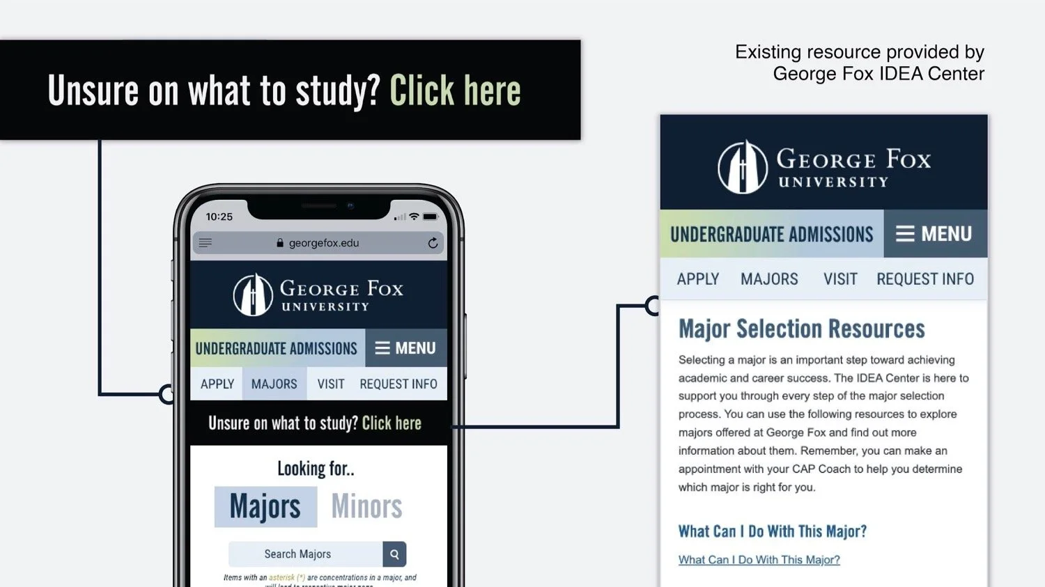
The goal wasn’t to reinvent the site, but to make it more functional, accessible, and intuitive — all while maintaining brand integrity, satisfying multiple stakeholders, and ensuring easy implementation. The key challenge was to improve usability and organization without removing essential information or disrupting the established look and feel of the George Fox brand.
The Solution
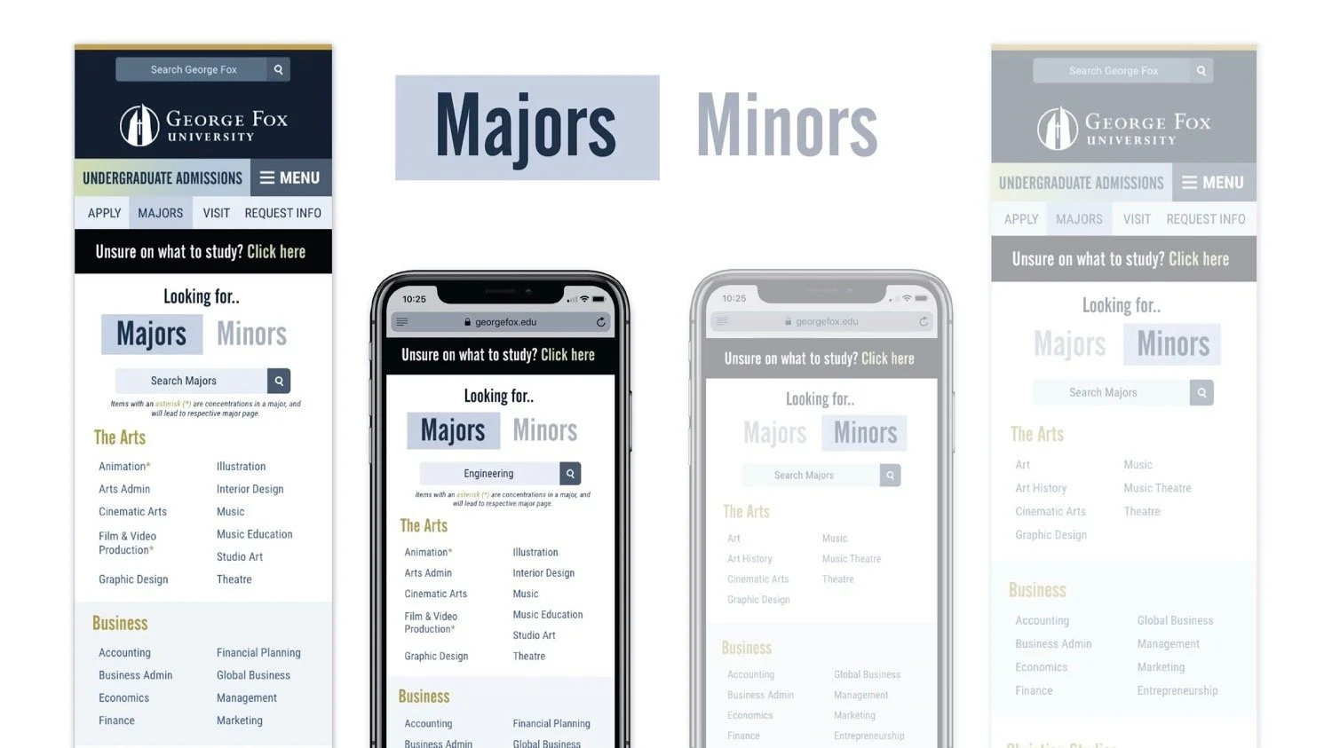
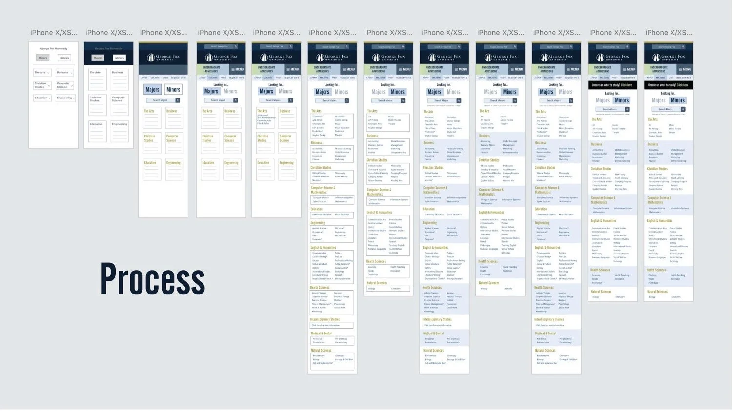
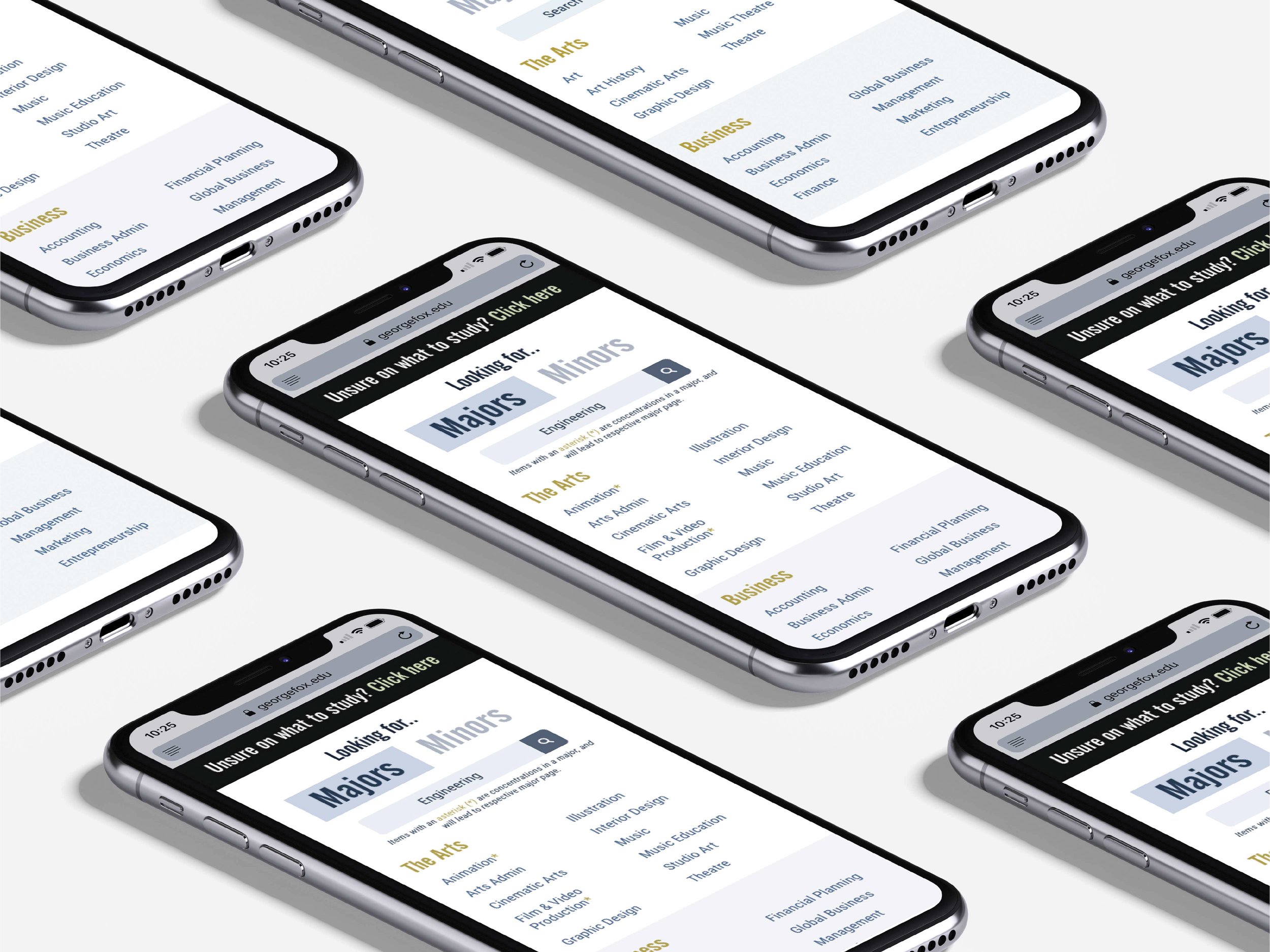
The redesign focused on leveraging existing assets, reorganizing content for clarity, and enhancing the user experience through thoughtful interaction design. Early testing showed that dropdown menus caused confusion, so the final layout grouped majors by department and organized them alphabetically within a two-column layout — cutting down scroll time and improving readability.
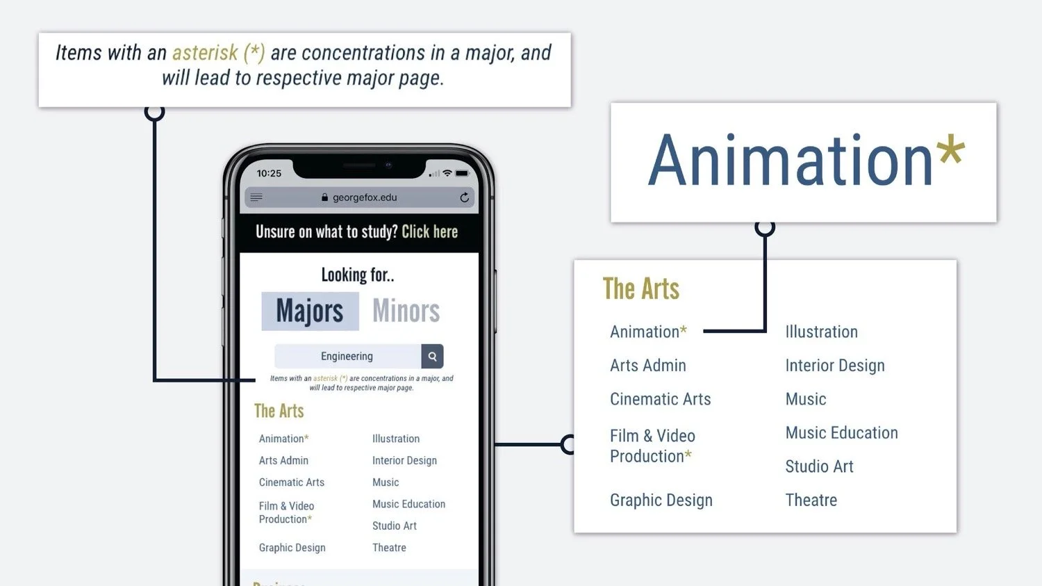
Attention to micro-details such as padding, type spacing, color contrast, and background opacity (optimized at 64.5%) refined the overall usability and aesthetics. Subtle updates — like enhancing the gold asterisk distinguishing concentrations from majors — made existing features more effective. Through iterative user testing and feedback, the final design delivered a cleaner, faster, and more intuitive mobile experience that aligned perfectly with George Fox University’s visual identity and user needs.


GEORGE FOX
WEBSITE REDESIGN
The Challenge
George Fox University’s Marketing Communications department needed a mobile-friendly redesign of its “Majors and Minors” page — a resource heavily used by high school students and their parents researching academic programs. Over half of the site’s traffic was already coming from mobile devices, yet the existing layout wasn’t optimized for smaller screens.
The goal wasn’t to reinvent the site, but to make it more functional, accessible, and intuitive — all while maintaining brand integrity, satisfying multiple stakeholders, and ensuring easy implementation. The key challenge was to improve usability and organization without removing essential information or disrupting the established look and feel of the George Fox brand.
The Solution
The redesign focused on leveraging existing assets, reorganizing content for clarity, and enhancing the user experience through thoughtful interaction design. Early testing showed that dropdown menus caused confusion, so the final layout grouped majors by department and organized them alphabetically within a two-column layout — cutting down scroll time and improving readability.
Attention to micro-details such as padding, type spacing, color contrast, and background opacity (optimized at 64.5%) refined the overall usability and aesthetics. Subtle updates — like enhancing the gold asterisk distinguishing concentrations from majors — made existing features more effective. Through iterative user testing and feedback, the final design delivered a cleaner, faster, and more intuitive mobile experience that aligned perfectly with George Fox University’s visual identity and user needs.